Published May 16, 2025 in reports
Starnus – A Bold New Identity
Author: Ayda at Starnus
We Gave Starnus a Fresh Coat of Paint
You might notice something different the next time you land on Starnus. The colors feel brighter, the logo breathes easier, and the typography finally looks as sharp as the product it represents. After two intense design sprints (and more gradient swatches than we care to admit), we’re thrilled to unveil Starnus’s new visual identity.
Why Change What Wasn’t Broken?
The original look served us well when Starnus was a scrappy prototype. But as our community, platform, and ambitions grew, the old visuals started to feel… compressed. A favicon shouldn’t look like a Rorschach test—and a conference banner shouldn’t fade into the carpet. We needed a system that scales from 16 pixels to 16 feet without losing itself.
What’s Actually New
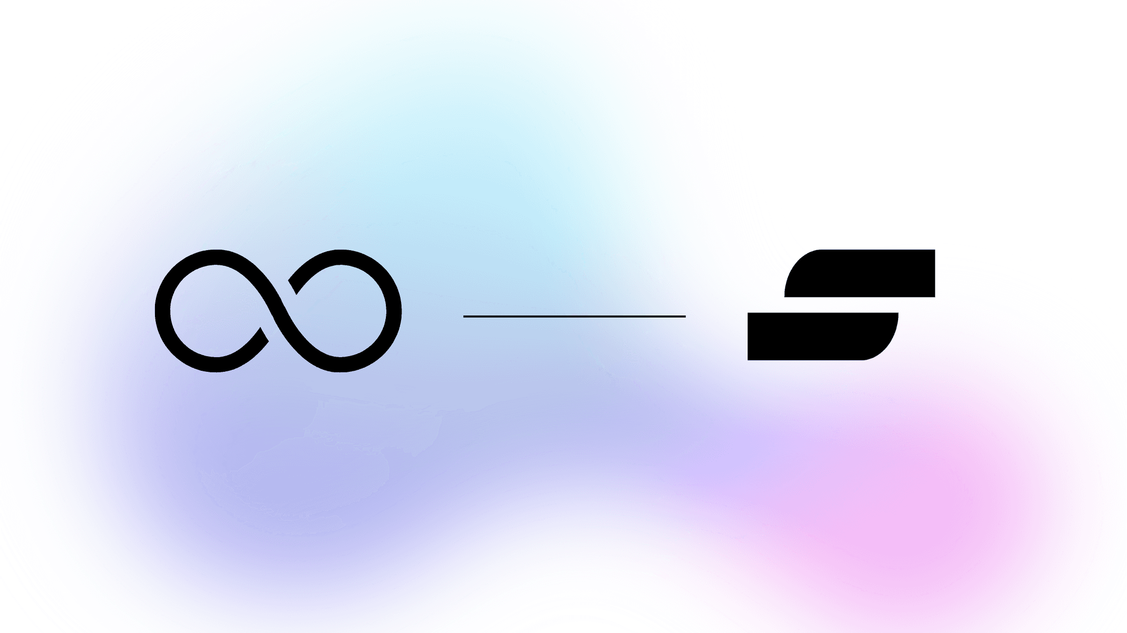
Logo, Simplified
Clean geometry, balanced proportions, zero clutter. It snaps into place everywhere from browser tabs to billboard mock-ups.A Gradient With Intent
Aqua to violet to sunset pink. Cool discovery → creative momentum → warm human impact. It works in light mode, dark mode, and everything between.Sharper Type Hierarchy
A versatile geometric sans family—crisp at small sizes, confident in headlines, consistent across languages.
What Hasn’t Changed
Our Name. Still Starnus.
Our Mission. Help you get more done with less friction.
Our Roadmap. All product milestones stay exactly where you left them.
This refresh gives us a system that’s clear, confident, and joyful—just like the platform experience we strive to deliver.
Tell Us Your Thoughts
Love it? Want a slightly different hue? We’re all ears. Send feedback to marketing@starnustech.com.
Here’s to a brighter, bolder Starnus—same name, fresh identity.
We Gave Starnus a Fresh Coat of Paint
You might notice something different the next time you land on Starnus. The colors feel brighter, the logo breathes easier, and the typography finally looks as sharp as the product it represents. After two intense design sprints (and more gradient swatches than we care to admit), we’re thrilled to unveil Starnus’s new visual identity.
Why Change What Wasn’t Broken?
The original look served us well when Starnus was a scrappy prototype. But as our community, platform, and ambitions grew, the old visuals started to feel… compressed. A favicon shouldn’t look like a Rorschach test—and a conference banner shouldn’t fade into the carpet. We needed a system that scales from 16 pixels to 16 feet without losing itself.
What’s Actually New
Logo, Simplified
Clean geometry, balanced proportions, zero clutter. It snaps into place everywhere from browser tabs to billboard mock-ups.A Gradient With Intent
Aqua to violet to sunset pink. Cool discovery → creative momentum → warm human impact. It works in light mode, dark mode, and everything between.Sharper Type Hierarchy
A versatile geometric sans family—crisp at small sizes, confident in headlines, consistent across languages.
What Hasn’t Changed
Our Name. Still Starnus.
Our Mission. Help you get more done with less friction.
Our Roadmap. All product milestones stay exactly where you left them.
This refresh gives us a system that’s clear, confident, and joyful—just like the platform experience we strive to deliver.
Tell Us Your Thoughts
Love it? Want a slightly different hue? We’re all ears. Send feedback to marketing@starnustech.com.
Here’s to a brighter, bolder Starnus—same name, fresh identity.
Contact
Legal
© 2025 Starnus All rights reserved.
© 2024 Starnus All rights reserved.